The wrist is the placement people ask me about more than any other, and it is also the one they underestimate most. A wrist tattoo is the most personal piece of real estate on the body — you will see it more often than anyone else ever will.
That changes how you should choose it. A design on your back is for other people. A design on your wrist is a thing you glance at while typing, driving and washing your hands, thousands of times a year.
I have watched friends fall in love with a saved reference image, only for their artist to explain that the detail simply will not fit in a two-inch band. That conversation is worth having early, and it is why I usually point people toward tiny wrist tattoo ideas for women before they commit to something ornate.
Below are the styles that hold up on this placement, the ones that need more care than the internet suggests, and the practical detail — comfort, ageing, coverage — that tends to get skipped.
Which Wrist Placement Is Right for You?
“Wrist tattoo” covers at least five distinct spots, and they behave differently. Here is how they compare in practice.
| Placement | Visibility | Typical Comfort | Ageing | Best Suited To |
|---|---|---|---|---|
| Inner wrist | Hidden when arms rest at your sides | Sharp but brief; thin skin over tendons | Good — low sun exposure, little friction | Script, small symbols, dates, fine-line florals |
| Outer wrist | Seen constantly by you and everyone else | Generally the easier side of the two | Fair — more sun, so sunscreen matters | Illustrative pieces, small animals, bolder linework |
| Side of wrist | Subtle; visible mainly at certain angles | Bony and thin — usually the spiciest spot | Fair — fine detail can soften over the years | Tiny icons, short words, single-line designs |
| Wrap-around | Always visible from some angle | Longest sitting; comfort varies as you rotate | Good if linework is not too delicate | Bracelet designs, chains, floral bands, blackwork |
| Wrist into forearm | Easy to cover with a sleeve | Comfortable once past the wrist crease | Best of the group — more room, less friction | Larger blossoms, statement pieces, future sleeve starts |
If you are torn, the inner wrist is the safest starting point — it is discreet, it ages well, and it suits the small meaningful designs most people want here.
What Actually Affects How a Wrist Tattoo Ages
Three things determine whether a wrist piece still looks sharp in a decade: line weight, sun exposure and friction.
Line weight matters most. Ink spreads very slightly under the skin over the years, and lines placed close together have less room to spread before they touch.
This is why an artist may push back on a design with dense internal detail. They are not being difficult — they are protecting the piece from becoming a grey smudge by its tenth birthday.
Sun exposure is the second factor, and the outer wrist gets more of it than almost anywhere except the hands and face. Friction is the third: watches, bracelets, sleeve cuffs and the edge of a desk all work at the same small patch of skin every day.
None of this makes the wrist a bad placement. It just means slightly bolder linework and a habit of sunscreen buy you years. If comfort is your bigger worry, the tattoo pain chart is a useful reference point, though every body disagrees with it somewhere.
Wrist Tattoo Ideas for Females, Style by Style
These are the styles I see working on wrists again and again, roughly in order of how often people ask for them.
Fine-Line Floral Wrist Tattoos
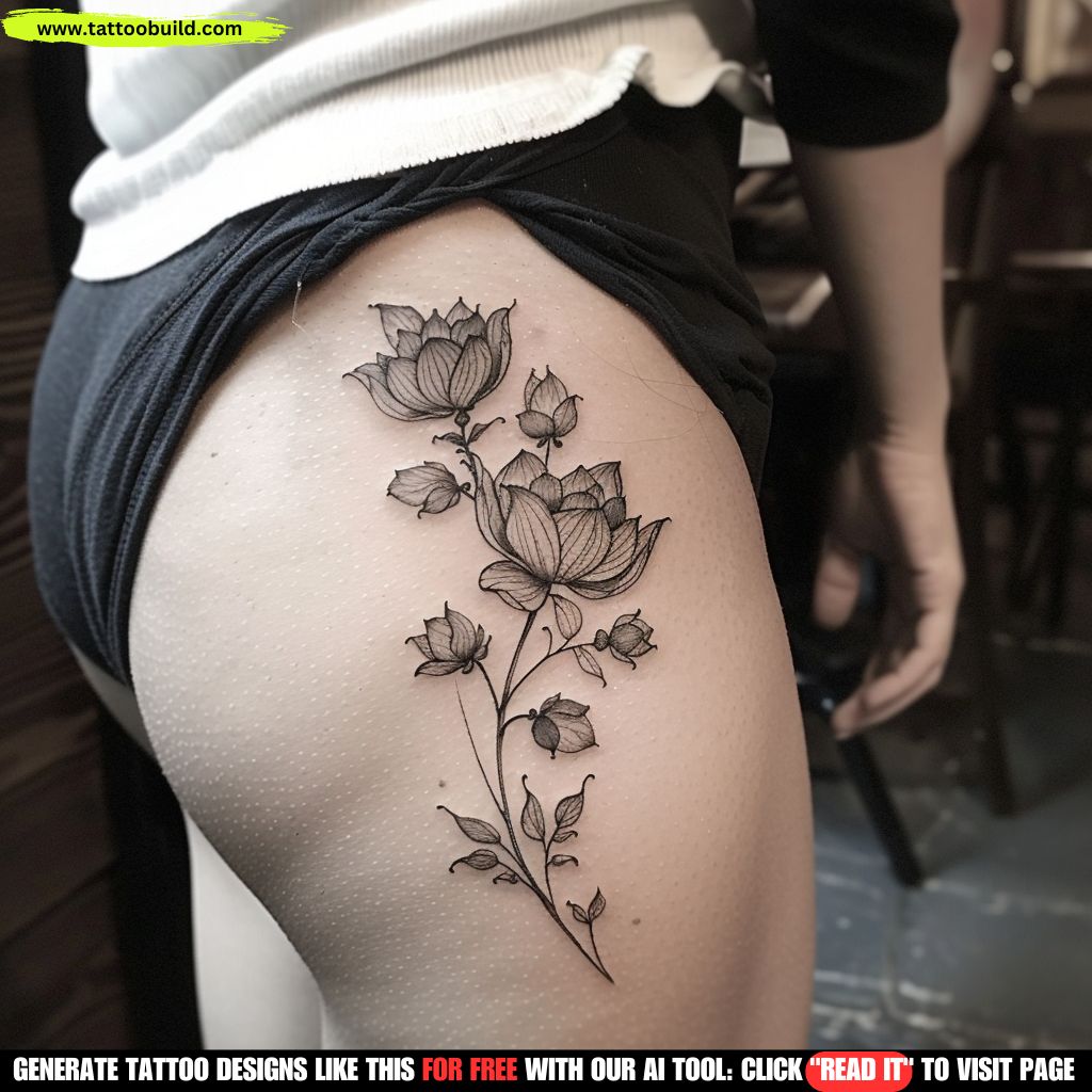
Fine-line botanicals are the default request for this placement, and for good reason: a stem follows the natural line of the arm, and a small cluster of blooms fills the inner wrist without crowding it.
The version that ages best keeps the flowers slightly larger than feels necessary and leaves visible gaps between petals. Detail you cannot see from arm’s length is detail that will blur.
When I tested this idea against pieces I have watched heal, the ones with a handful of confident lines consistently outlasted the ones packed with hatching. Restraint is what makes fine-line work last.
Peonies, wildflowers and single roses are the usual subjects. If you want the whole style explained properly, our guide to fine-line tattoo ideas covers what it can and cannot do.
Bracelet and Wrap-Around Wrist Tattoos
A bracelet tattoo does something clever: it uses the shape of the wrist instead of fighting it. The design circles the arm the way real jewellery does, so it reads as intentional from every angle.
Floral bands, chains, thin double lines and blackwork cuffs all work. The design decision that matters is whether the band closes completely or leaves a deliberate gap.
A full closure looks like jewellery. A gap looks more organic and, in my experience, is easier to place well because the artist can put the break where the skin moves most.
Expect a longer sitting than a small motif, since the artist has to rotate your arm repeatedly. Browse women’s bracelet tattoo ideas for the jewellery-inspired end of this, or wrap-around wrist tattoos for bolder bands.
Bold Blackwork and Statement Blossoms
The opposite approach to fine line, and an underrated one. A single large flower in solid black, using negative space rather than shading to create form, is a striking wrist piece.
Because the shapes are large and the ink is dense, this style ages exceptionally well — there is nothing fine enough to blur.
It usually needs to run from the wrist up into the inner forearm to have room to breathe, which is worth knowing before you plan it as a standalone wrist tattoo.
If you like the weight of black ink but want softer edges, black and grey floral designs sit neatly between the two approaches.
Colour and Watercolour Wrist Tattoos
Colour on the wrist is beautiful and demanding. Saturated pigment in a small area looks brilliant fresh, and it is the style most dependent on how well you protect it.
Because the wrist gets so much sun and friction, colour here tends to need touch-ups sooner than the same design would on an upper arm.
Watercolour styles that rely on soft edges without any anchoring linework are the riskiest of all — without a structural line to hold the shape, softening reads as fading.
I would still get it. I would simply go in knowing colour on the wrist is a commitment to sunscreen, and ask the artist to include some line structure underneath.
Script, Quotes and Single Words
The inner wrist is the natural home for text. A name, a date, a single word or a short phrase running along the arm rather than across it.
The mistake I see most often is choosing a font at screen size and being surprised when it does not survive at skin size. Delicate serifs and tight cursive loops are exactly the details that close up over time.
A clean, slightly heavier script with generous spacing between letters is the version that still reads clearly in fifteen years.
Ask your artist to draw the text at actual size on your wrist with a stencil before anything is permanent. For wording that people actually keep, quote tattoo ideas for women is a good starting point.
Symbols, Dates and Tiny Icons
The smallest category, and the one with the highest hit rate. A tiny moon, a semicolon, a heartbeat line, coordinates, Roman numerals, a matching symbol shared with a sibling.
These work because they ask almost nothing of the skin — a handful of lines, plenty of space, nothing to blur into anything else.
They are also the easiest to build on later. Several people I know started with one small symbol on the inner wrist and, years on, have grown it into a half sleeve.
The one caution: very small text is the single most common regret. Numbers under about a centimetre tall tend to lose legibility faster than anything else on this list.
Butterflies, Birds and Small Animals
Butterflies remain the most requested motif on this placement, followed by birds in flight and small pets rendered in line work.
A butterfly works on the wrist because its silhouette is instantly readable even when simplified, so it survives being scaled down better than most subjects.
Birds are usually done as a small flock, spaced apart and reducing in size — a design that suits the narrow band of the wrist naturally.
Pet portraits are the tricky one. A realistic portrait needs far more room than the wrist offers; a simplified line drawing of the same animal usually carries more feeling anyway.
Illustrative and Vintage Pieces
Antique pocket watches, keys, compasses, moths and celestial motifs — the illustrative end of the spectrum, drawn with shading rather than flat colour.
These pieces need more room than people expect. A watch face with Roman numerals and a rose surround is realistically a wrist-into-forearm design, not a two-inch one.
When there is space, this style ages well because the shading gives the artist room to build contrast that survives ink spread.
The clock tattoo is the most enduring example of the genre, and one of the few motifs that genuinely earns the extra space.
If the Wrist Isn’t Quite Right
Sometimes the honest answer is a different placement. These three give you a similar feeling with different trade-offs.
Inner Forearm
The closest substitute. Same visibility when you want it, same easy coverage, but far more room and noticeably gentler to sit through.
If your reference image is too detailed for the wrist, this is almost always where your artist will suggest moving it.
Ankle
An ankle piece gives you the same delicate, bracelet-like effect with more privacy. It is more comfortable to hide day to day and gets less sun.
The trade-off is healing: socks, shoes and swelling make the ankle a fussier area to look after in the first two weeks.
Side of the Finger or Behind the Ear
The most discreet options, and the least durable. Finger tattoos in particular fade unusually fast because the skin regenerates quickly and the hands take constant wear.
Go in expecting touch-ups. Plenty of people think that is a fair price for the placement, and I would not talk anyone out of it — only make sure nobody promises you otherwise.
Aftercare and Keeping a Wrist Tattoo Sharp
The wrist is a slightly awkward area to heal, mostly because it is in constant motion and constantly touching things. A few habits make a real difference.
Keep it clean and lightly moisturised, follow the specific instructions your artist gives you, and resist the urge to over-apply ointment — a thin layer is the goal. Surface healing commonly takes around two to three weeks, with the deeper layers settling over a couple of months.
Leave watches, bracelets and tight cuffs off that wrist until it has fully healed. Rubbing is the fastest way to pull ink out of a fresh tattoo, and the wrist offers more opportunities for it than most placements.
Once healed, sunscreen is the one habit that separates a crisp ten-year-old tattoo from a faded one. Our tattoo aftercare guide covers the full timeline.
One important caveat: if you notice spreading redness, heat, swelling that worsens after the first few days, pus or a fever, that is not normal healing — contact your artist and see a doctor. Nothing in this article is medical advice. The American Academy of Dermatology and the US Food and Drug Administration both publish plain-language guidance on tattoo risks and ink safety worth reading before your first appointment.
Common Wrist Tattoo Mistakes — and Still Not Sure?
The mistakes I see repeat themselves. Choosing a design at screen size rather than skin size. Insisting on detail the placement cannot hold. Picking a font instead of picking a piece of lettering.
Two more worth naming: getting a wrist tattoo specifically to cover something, without discussing coverage with an artist who does that work regularly; and booking with whoever is available this week rather than waiting for the person whose portfolio actually matches your style.
Waiting is nearly always the right call. A good artist’s waitlist is short compared with how long you will wear the result.
If you are still weighing it up, it helps to see more of the range before you decide — our wider collection of women’s wrist tattoo ideas is the natural next stop. For general risk information, Mayo Clinic keeps an accessible overview.
Frequently Asked Questions
Do wrist tattoos hurt more than other placements?
The wrist sits in the middle of most pain charts, not at the top. In my experience the inner wrist is a sharp, buzzy sensation rather than a deep ache, and the side of the wrist over the bone is noticeably worse than the flat inner or outer surfaces. The saving grace is time: most small wrist pieces are finished inside an hour, so there is not much sitting to endure. Pain tolerance is deeply individual, though, so treat any chart as a rough guide rather than a promise.
Will a wrist tattoo fade faster than one on my arm?
It can, and there are two reasons. The outer wrist catches a lot of sun, and the wrist as a whole takes constant friction from sleeves, watches, bracelets and desk edges. Very fine lines packed close together are the most vulnerable, because as ink settles over the years those lines soften and can start to merge. Daily sunscreen once the tattoo is fully healed is the single most useful habit, and every artist I have asked says the same thing.
How much space do I actually have on my wrist?
Less than most people expect. The usable band between the hand and the start of the forearm is often only two to three inches deep, which means a design with lots of small internal detail has to be scaled up or simplified. A good artist will tell you honestly when a reference image will not hold together at wrist size. If you love a detailed piece, running it from the wrist up into the inner forearm is usually the better compromise.
Can a wrist tattoo be covered for work?
Usually, yes. An inner wrist piece disappears when your arms hang naturally, and a watch, cuff or long sleeve covers most wrist placements comfortably. Wrap-around and outer wrist designs are the hardest to hide because they are visible from more angles. If workplace policy is a real concern, I would ask your artist to keep the design inside the area a standard watch face and strap would cover.
Is the wrist a good spot for a first tattoo?
It is a reasonable one. Sessions are short, the placement is meaningful to a lot of people, and the design is right there where you can enjoy it. The honest counterpoint is that it is a visible, high-wear location, so it is worth being sure about the design rather than treating it as a low-stakes starter piece. If you want the same experience with more forgiveness, the inner forearm gives you a nearly identical look with easier healing.
Quick Summary
- The inner wrist is the most forgiving spot — discreet, low sun exposure, and suited to the small meaningful designs most people want.
- Line weight decides longevity. Slightly bolder lines with visible gaps outlast dense fine detail every time.
- You have less room than you think — often only two to three inches. Detailed references usually need to run into the forearm.
- Bracelet and wrap-around designs use the shape of the wrist rather than fighting it, and read well from every angle.
- Colour and watercolour look stunning here but demand sunscreen and are more likely to need touch-ups.
- Very small text is the most common regret. Size lettering for legibility in fifteen years, not for the stencil photo.
- Keep watches and bracelets off the fresh tattoo, and see a doctor rather than the internet if healing looks wrong.