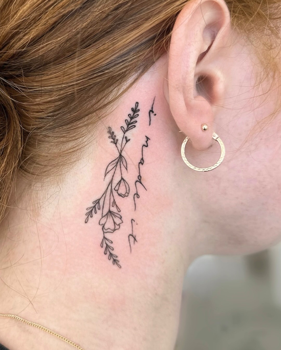
I have sat in enough consultations to notice a pattern: the women who leave happiest are almost never the ones who booked the biggest piece. The simple tattoo is the one people keep loving a decade later, because it was designed to age rather than to impress.
A thin stem, a clean crescent, three words in a steady script — these read as jewellery rather than as a statement, and they slide into a professional life without asking permission.
Over the last few years I have collected the designs that keep coming back through studio doors, and I have asked artists which of them still look sharp on returning clients. The 22 below are the survivors, most of them built on fine line work that stays quiet on the skin.
Every idea here includes what it actually costs you in healing, in placement compromise, and in touch-ups — not just what it looks like on day one.
Which Simple Style Is Right for You?
Most of the ideas below fall into one of four technical families, and the family matters more than the motif. Here is how they behave over time, based on what I have seen come back for touch-ups.
| Style | Best For | Sitting Time | How It Ages |
|---|---|---|---|
| Fine line / single needle | Florals, script, small animals, anything delicate | Usually well under an hour | Softens gradually; expect a touch-up somewhere in the first several years, especially on hands and feet |
| Bold minimalist linework | Symbols, geometric shapes, silhouettes | Short, often 30–60 minutes | The most forgiving option — thicker lines hold their shape for decades |
| Micro-script lettering | A word, a date, a short line of text | Short, but demanding on the artist | Riskiest at very small sizes; tight letters can blur together, so size up rather than down |
| Dotwork and stippling | Moons, constellations, soft shading without solid black | Longer than it looks — dots take patience | Light stippling can fade unevenly; denser dotwork holds better |
What Actually Makes a Simple Tattoo Timeless
Timelessness is not a mood. It is a set of design decisions that happen to keep working long after the trend that produced them has moved on.
The first is contrast between ink and empty skin. A design that leaves generous space around itself stays readable as the lines soften, because your eye reads the gap as much as the mark.
The second is that the subject is not tied to a moment. A leaf, a moon, a bird — these had meaning long before Instagram and will have it afterwards. A logo, a lyric from this year, or a font that screams a specific decade will not.
The third is line weight relative to size. In my experience this is the single most common regret: a beautiful design shrunk past the point where the artist can keep the lines apart. If a design needs to be two inches to breathe, giving it one inch does not make it more elegant, it just makes it a smudge in eight years.
The fourth is honest placement. Areas that see constant friction and sun — hands, fingers, feet, the outer forearm — will always demand more maintenance, regardless of how good the artist is. That is a trade, not a dealbreaker, and it helps to know it before you book rather than after. If budget is part of the decision, it is worth reading up on what a small tattoo actually costs before you narrow anything down.
22 Simple Tattoo Ideas for Women
Each of these is genuinely small and genuinely simple. I have noted what to watch out for on the ones that are trickier than they look.
1. Fine Line Floral
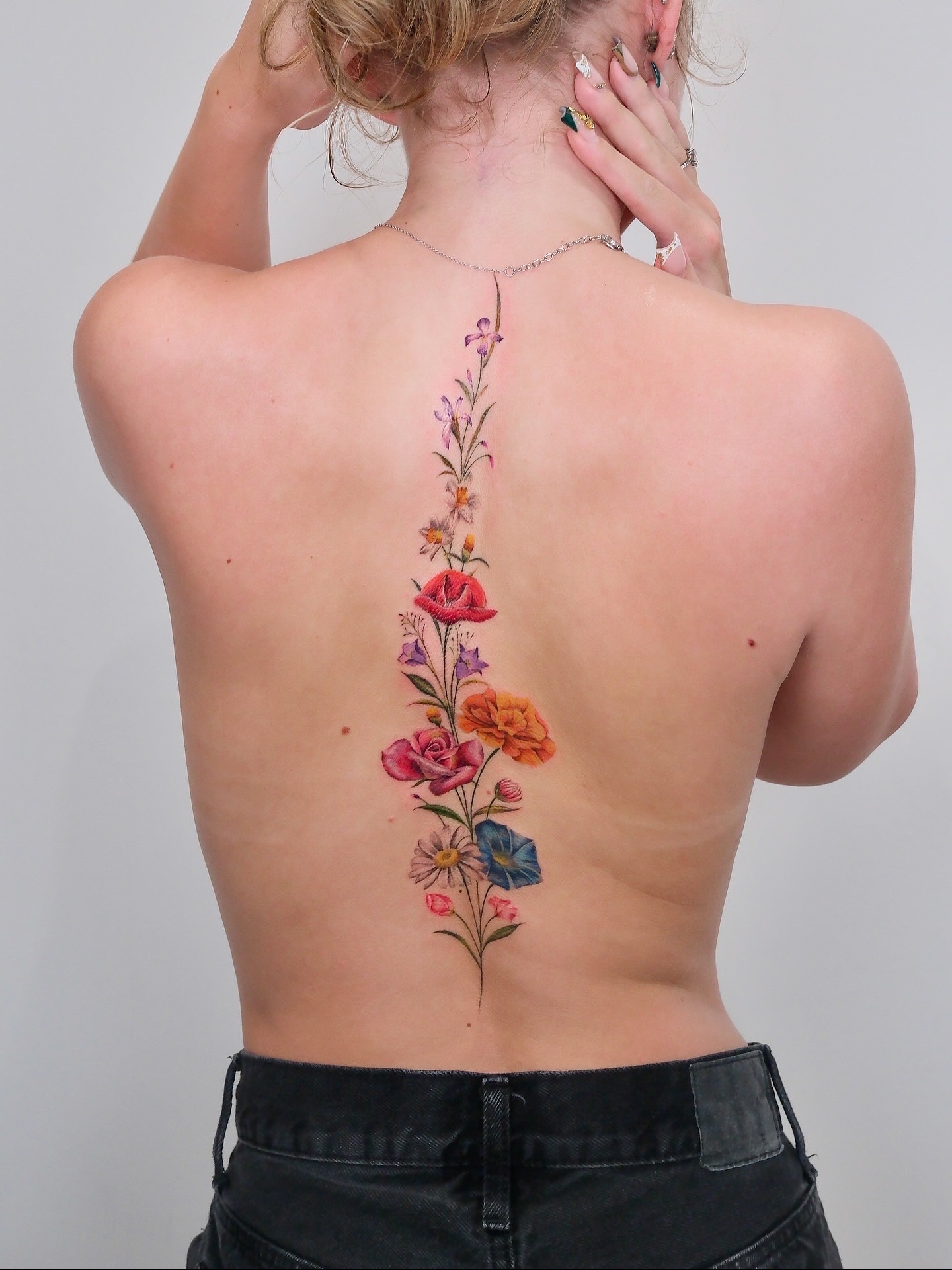
A single stem — lavender, a sprig of wildflower, a narrow eucalyptus branch — traced in one continuous weight of line. It is the design that begins more first tattoos than anything else I have seen, and for good reason.
The appeal is that it reads as botanical illustration rather than as decoration, so it sits comfortably on an inner forearm at a work meeting. Ask your artist to vary the line weight very slightly between stem and petal; it is a small thing that stops the piece looking flat.
Give it length rather than width. A stem that runs four or five inches along the arm has room for detail without ever feeling large. The version pictured above is about as delicate as I would go on a wrist.
2. Minimalist Moon
A crescent, an outline, or a simple filled shape. The moon is the most reliably requested symbol among the women I have talked to, and the simplest interpretations outlast the ornate ones.
A solid black crescent is the safest technically — no fine internal detail to blur — and it works at genuinely tiny sizes where a detailed moon would not.
If you want something with a little more narrative, a thin outlined crescent with a single dot inside stays minimal while suggesting more.
Photo: @annsavagetattoo_siargao
3. Single Rose
Not a traditional shaded rose, but a fine line one: petals suggested rather than filled, the whole thing readable in two seconds. It manages to be classic without being retro.
The risk is that roses have a lot of internal line work by nature. At small sizes those lines want to merge, so this is one to size generously — I would not go under two inches on a forearm.
There is a lot of range in interpretation here, and it is worth browsing rose tattoo ideas for women before you settle on a style.
4. Butterfly
A clean butterfly outline is one of the few motifs that works at almost any scale. Symmetry does most of the work, so the design stays legible even as lines soften.
Ask for slightly asymmetric wings if you want it to feel drawn rather than stamped. Perfectly mirrored butterflies can look like clip art on skin.
Placement matters more than size here. The shoulder blade, the ribs and the ankle all suit the shape, because the wings have somewhere to sit.
5. Delicate Snake
A thin coiled snake carries mystique without any of the heaviness of traditional serpent work. It also solves a common problem: it follows the curve of a limb naturally, so it flatters an ankle or a forearm rather than fighting it.
Keep the scales suggested rather than drawn. A few marks along the body read as texture; a full scale pattern at this size will fill in within a few years.
Snakes carry meaning across a lot of cultures — shedding, renewal, wisdom — which is part of why they age well as a choice.
Photo: @arrealidart
6. Star Constellation
Your birth constellation, or one that matters to you, rendered as small dots with hairline connecting lines. It is personal without being legible to strangers, which is exactly what some people want.
The technical warning here is real: hairline connecting lines are among the first things to fade, particularly on the ribs or upper arm. Ask for the connecting lines to be very slightly heavier than they look in the reference.
If you want to see how different star arrangements sit on the body, the constellation tattoo guide has a broader spread of layouts.
7. Single Wave
One continuous line that rises and breaks. It is about as minimal as a recognisable image gets, and it is a good choice if you want something meaningful that does not look symbolic.
Because it is a single stroke, everything depends on the artist’s hand — there is nowhere to hide a wobble. This is one to book with someone whose linework you have seen in person.
It suits the inner arm, the collarbone and the side of the ankle particularly well, because those areas give a horizontal line room to run.
Photo: @amyjtattoos
8. Lotus Flower
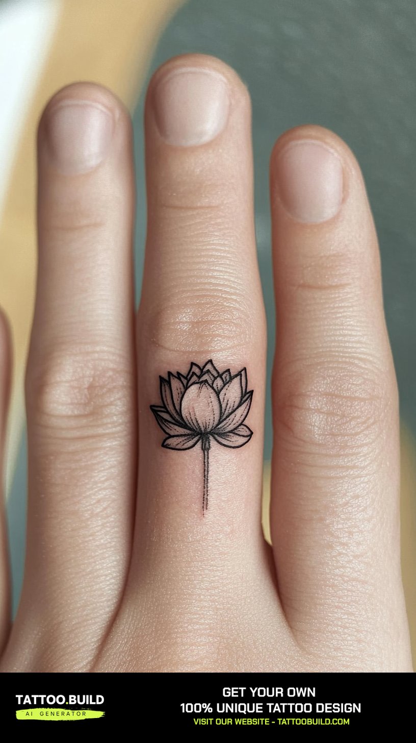
A minimalist lotus keeps the petal structure but drops the shading entirely. The result is graphic and calm, and it holds its shape better than most flowers at small scale.
It carries genuine weight as a symbol — growth out of difficulty — which is worth knowing if you want the meaning as well as the shape.
The ankle is the classic placement, though it will demand more sun protection there than almost anywhere else on the body.
9. Hummingbird
Small, fast, detailed — a hummingbird is the most technically demanding piece on this list at a small size. In the right hands the result is beautiful.
The wings are where it goes wrong. Ask your artist to simplify the wing structure rather than reproduce every feather; the ones I have seen age best had suggested wings and a detailed body.
Between the shoulder blades or on the upper arm gives it the space it needs.
Photo: @denizhanvardeniz
10. Script or Single Word
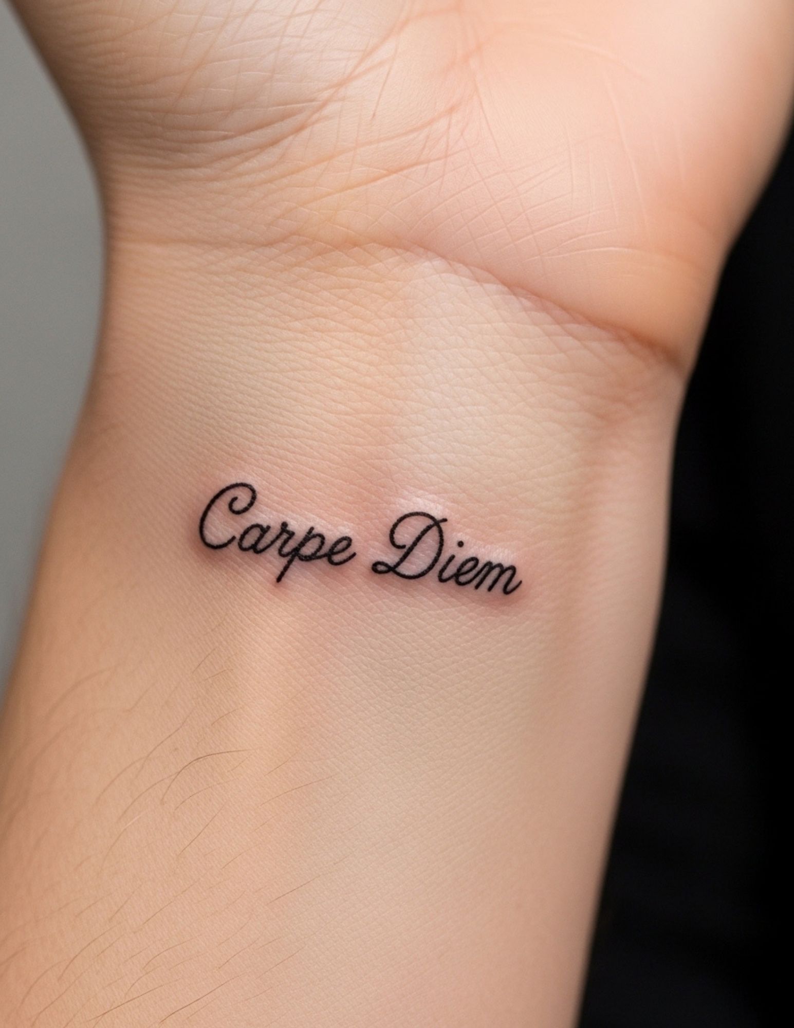
One word, in a font you can still read at arm’s length. Choose the word carefully, because unlike an image it is unambiguous and permanent.
Every artist I have asked says the same thing about script: go bigger than you think, and avoid the very thin decorative fonts. Tight loops close up over time and turn a word into a shape.
If you are still narrowing down what to write, the quote tattoo ideas for women collection is a useful place to test wording before you commit.
11. Geometric Shape
A triangle, a circle, a few clean intersecting lines. Geometric work is the most forgiving simple tattoo there is, because straight lines and circles stay recognisable no matter how much they soften.
The catch is that geometry is unforgiving of a shaky hand — a circle that is slightly off is visibly off in a way a leaf never would be. Many artists use a stencil or guide for this, which is a good sign rather than a shortcut.
It is also the easiest style to add to later, since shapes sit well beside other shapes.
12. Dragonfly
A dragonfly gives you the delicacy of an insect wing with a much simpler body than a butterfly or a bee. Fine line suits it perfectly.
The wing veining is the detail that makes it, and also the detail that blurs first. Ask for fewer, cleaner veins rather than an accurate reproduction.
It reads well on the forearm, the shoulder and just behind the ear if you want it barely visible.
Photo: @____toledo
13. Feather
A single feather in soft linework is quiet and adaptable, and it does not lock you into a specific meaning the way many symbols do.
Keep the barbs loose and slightly separated. A feather drawn as a solid outline with dense internal lines will fill in; one drawn as a suggestion will not.
The forearm and the ribs are the two placements I have seen work most consistently, since a feather wants length.
Photo: @ann.tattoo.ink
14. Small Heart
A tiny outlined heart is the most understated piece on this list. Two lines, no detail, nothing to go wrong.
Fingers are the popular placement and also the worst one — finger tattoos fade faster than anywhere else on the body, and many artists will tell you upfront to expect touch-ups. Move it to the side of the wrist or behind the arm if you want it to stay crisp.
It is a good candidate for a matching piece with someone, precisely because it is small enough not to overcommit.
Photo: @acmw_
15. Botanical Leaf
A single leaf or a short leafed branch — fern, olive, eucalyptus. It has the elegance of a floral without the internal complexity, which makes it one of the safest technical choices here.
Following the natural line of a limb is what sells it. A leaf that runs along the forearm rather than across it looks like it belongs there.
This is also the easiest design on the list to extend later into something larger, if you decide you want more.
16. Arrow
A single clean arrow — direction, intent, forward motion. It is one of the few symbols that is genuinely legible at a very small size.
The fletching is the only place detail accumulates, and it can be simplified to three short strokes without losing anything.
It works particularly well on the forearm and the side of the ribs, where a straight line has somewhere to travel.
Photo: @3pleitattoo
17. Crescent Moon with Stars
A crescent with two or three small stars scattered around it. It fills a space more gracefully than a single element and still counts as minimal.
Ask for the stars to be genuinely varied in size. Evenly sized, evenly spaced stars look mechanical; irregular ones look like a sky.
For more arrangements in this family, the moon phase tattoo ideas collection covers the fuller layouts.
18. Minimalist Portrait or Silhouette
A face or a figure drawn as one continuous line. It is modern, it is unmistakably art rather than decoration, and it has held up better than I expected it to.
This is the design most dependent on the artist’s drawing ability rather than their tattooing. Look specifically for continuous-line work in a portfolio — it is a distinct skill.
Give it room. Continuous-line portraits shrink badly; the upper arm or the thigh serves them better than the wrist.
Photo: @dejamort_tattoo
19. Semicolon
A semicolon marks a sentence that could have ended and did not. It has become a widely recognised symbol of continuing through mental health struggle, and it carries that meaning to most people who see it.
It is worth knowing that the meaning is recognisable — this is not a private symbol, and people may ask. For many that is the point.
It is small enough for almost anywhere, and it is often incorporated into a word or a line rather than standing alone.
Photo: @walt_tattoo_mke
20. Infinity Symbol
Two loops, endlessly. It is the most familiar design here, which is both its strength and its weakness.
If you want it to feel less generic, ask your artist to break the symmetry slightly, or to work it into a stem or a wave so it is doing two things at once.
Kept thin and small on the inner wrist or behind the arm, it stays elegant rather than dated.
Photo: @moran.tattooer
21. Bird Silhouettes
Two or three small birds in flight, drawn as filled shapes rather than outlines. Solid silhouettes are technically the safest small tattoo of all, because there is no internal detail to lose.
Vary the size and the angle so they read as a flock in motion. Identical birds at identical angles look like a pattern.
This one suits the wrist, the collarbone and the ankle, and it is small enough to place somewhere only you usually see.
22. Vine or Branch
A trailing vine that wraps softly around an arm, an ankle or a finger. It is the most flattering shape on this list, because it is designed around the body rather than placed onto it.
Keep the leaves sparse. A vine with too many leaves becomes a solid band as it ages, which is a very different tattoo from the one you asked for.
It is also endlessly extendable — many people start with a short section and add to it over years.
Variations Worth Considering
If none of the 22 is quite right, these are the adjustments I most often see people make to an idea they already like.
Go White or Skin-Tone Instead of Black
White ink and skin-tone work look ethereal on day one and unpredictable at year five. Results vary enormously with skin tone and sun exposure, and many artists decline the work entirely for that reason.
If you want something barely there, a very fine black line at low saturation is a more reliable route to the same effect.
Add a Single Colour Accent
One small point of colour in an otherwise black design — a red berry on a branch, a blue centre in a flower — keeps the piece minimal while making it specific to you.
Colour does fade faster than black, so treat the accent as a detail you may want refreshed rather than as the backbone of the design.
Make It a Matching Piece
Simple designs are the natural choice for matching tattoos, because they are small enough that neither person is committing to someone else’s taste in a large piece.
The version I have seen work best is complementary rather than identical — two halves of a moon, two different birds — so each tattoo still stands alone.
Build a Micro-Collection Over Time
Rather than one larger piece, several small ones placed along an arm or a collarbone, added over years. It spreads the cost and lets your taste evolve.
The one rule that keeps a collection coherent is sticking to a single line weight and a single artist where you can. Mixed weights read as accumulation rather than as design.
Placement, Healing and Aftercare
Placement is the decision that determines how your tattoo looks in ten years, more than the design itself does. Friction, sun and skin movement do the ageing.
The most forgiving areas are the inner forearm, the upper arm, the shoulder blade and the thigh — covered, low friction, relatively stable skin. The least forgiving are fingers, hands, feet, elbows and knees, where fading and touch-ups are the norm rather than the exception. The wrist placement guide covers the middle ground in more detail, since the wrist behaves differently on its inner and outer faces.
On healing: keep it clean, keep it moisturised lightly rather than heavily, and keep it out of the sun and out of pools until it has fully closed, which usually takes two to three weeks on the surface and longer underneath. Your artist’s specific instructions override anything you read online, including this article, because they know what ink and technique they used.
Sunscreen is the single highest-return habit for a fine line tattoo. UV exposure breaks down pigment, and delicate work has less pigment to lose. The American Academy of Dermatology has straightforward guidance on caring for tattooed skin that is worth reading before your appointment rather than after.
This is not medical advice. If a tattoo becomes hot, swollen, increasingly painful after the first few days, or develops a rash or discharge, that is a reason to see a doctor rather than to wait it out — the Mayo Clinic overview of tattoo risks sets out what warrants attention. And to say the obvious plainly: never tattoo or attempt to remove a tattoo yourself, and never let an unlicensed person do it for you.
Common Mistakes and How to Avoid Them
These are the four regrets I hear most often, and all four are avoidable at the booking stage.
Sizing down to make it more delicate. This is the big one. Delicacy comes from line weight and negative space, not from overall size, and shrinking a design past its floor is what produces the blurred pieces people show me years later.
Choosing an artist by price rather than by portfolio. Fine line is a specialisation, not a default setting — an excellent traditional artist may not be the right person for a hairline botanical, and a good one will tell you so.
Booking the placement before the design. It is much easier to find a home for a finished drawing than to force a drawing into a spot you already decided on.
Deciding under time pressure. If you are still unsure, look at a wider spread first — first tattoo ideas for women covers the practical side of a first appointment, and tiny tattoo ideas for women is useful if you want to go smaller than anything here.
Frequently Asked Questions
How small can a simple tattoo actually be?
There is no universal minimum, but most fine line artists I have spoken to are reluctant to go below roughly an inch for anything with internal detail. Solid shapes and single symbols can go smaller because there are no adjacent lines to merge. The honest test is to ask the artist directly whether the design holds at the size you want — a good one will tell you no if the answer is no. Sizing up slightly is almost always the decision people are glad they made.
Do fine line tattoos fade faster than traditional ones?
In most cases they do soften sooner, because there is less pigment in the skin to begin with. That does not mean they disappear; it means the crispness eases and a touch-up may be worth it somewhere down the line. Placement and sun exposure affect this far more than style does. A fine line piece on a covered inner arm can easily outlast a bolder one on a hand.
Which placement hurts least for a first tattoo?
Generally the outer or inner upper arm, the outer thigh and the shoulder blade are the most comfortable, since there is more tissue between needle and bone. Ribs, sternum, feet, hands and anywhere directly over bone tend to be sharper. Pain is also individual and varies with the day, so treat any ranking as a rough guide. Most simple designs are finished in well under an hour, which limits how much any of it matters.
Can a simple tattoo be added to later?
Yes, and the ones on this list are unusually good candidates. Vines, branches, constellations and geometric shapes all extend naturally. The practical advice is to tell your artist at the first appointment that you may add to it, so they place and weight the piece with that in mind. Staying with the same artist keeps the line weight consistent, which is what makes an added-to tattoo look designed rather than assembled.
Are white ink or skin-tone tattoos a good idea for something delicate?
They are the highest-variance option on the table. Results depend heavily on skin tone, sun exposure and how the ink settles, and many experienced artists will decline the work rather than promise an outcome they cannot control. If an artist is enthusiastic about it, ask specifically to see healed photographs at one year or more, not fresh ones. A very fine black line is the more predictable way to get a subtle result.
Quick Summary
- Simple tattoos age best when they leave generous negative space around the design.
- Line weight relative to size matters more than the motif — sizing down is the most common regret.
- Solid silhouettes and bold minimalist linework are the most forgiving technically; micro-script is the riskiest.
- Fine line florals, crescent moons, single leaves and small birds are the designs that keep coming back for good reason.
- Choose the placement after the design, not before, and favour covered, low-friction areas if you want it to stay crisp.
- Fingers, hands and feet fade fastest — beautiful, but plan on touch-ups.
- Sunscreen is the highest-return habit for keeping delicate work sharp.
- Book on portfolio, not price: fine line is a specialisation, and healed photos tell you more than fresh ones.